2026 2027 New Kits
Yes, it is that time of the year again when clubs launch their 3456789 new kits. There was a halcyon time when clubs had a red, white or blue shirt and it did not change for decades. Nowadays with a few honourable exceptions, most clubs are falling over themselves to launch a Rovers in Europe goalkeeper’s third shirt …..apparently blissfully unaware that they did not qualify for Europe!
So let’s look at the Good, Bad and the just plain Ugly offerings this summer.

- Manchester United

2. Liverpool

3. Arsenal
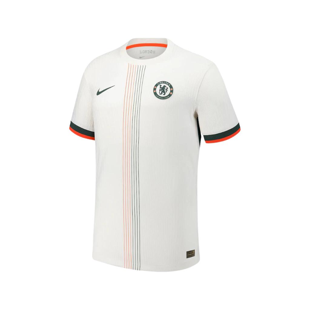
4. Chelsea
Here are a dozen shirts that have generated plenty of discussion. There is a good over view on the official Premier League site
| Club | Why it’s interesting |
|---|---|
| Manchester United (1) | A return to the classic polo collar. Many supporters say it has a late-1990s feel, while keeping a modern Adidas look. |
| Liverpool (2) | One of the boldest home shirts in years, featuring a subtle geometric pattern rather than plain red. It has divided opinion but stands out immediately. |
| Arsenal (3) | Heritage-inspired design with clean styling. The away shirt in particular has received excellent reviews for its understated colours. I will be watching to see how this helps in their relegation battle. |
| Chelsea (4) | The black-and-gold away shirt has become one of the most praised releases of the summer, with many fans calling it one of Nike’s best efforts. |
| Manchester City | Puma have kept things relatively traditional after several experimental seasons, appealing to supporters wanting a cleaner design. |
| Tottenham Hotspur | A crisp white shirt with subtle detailing. Unfortunately, Spurs have also attracted criticism after increasing replica shirt prices. |
| Newcastle United | Traditional black-and-white stripes remain, but with refined detailing that nods to earlier Adidas eras. |
| Leeds United | A classic white home shirt, although the third kit has received some of the weakest fan ratings so far. |
| Sunderland | Back in the Premier League with a smart red-and-white striped shirt. Fans are delighted to see top-flight football return, though the price rise has been unpopular. |
| Coventry City | Newly promoted and sporting a distinctive sky-blue strip. Another club whose shirt pricing has sparked debate. |
| Brighton & Hove Albion | The classic stripes remain, but with a wider stripe pattern that gives the shirt a fresh look. |
| Burnley | A very traditional claret-and-blue design which has been well received by supporters wanting a return to the club’s roots. |
A few background stories
Championship delays – Several EFL clubs took much longer to reveal their shirts this summer, with some supporters complaining that pre-season had already started before new kits were available. Reddit discussions show widespread frustration with late launches.
The retro revival – Polo collars, embroidered-style crests and designs inspired by the 1990s and early 2000s are everywhere this season.
Price controversy – Replica shirts are becoming increasingly expensive, with some Premier League clubs charging up to £90 for an adult shirt, prompting criticism from supporters.
Earlier launches – Most Premier League clubs now unveil next season’s kit before the previous season has even finished, because league rules allow teams to wear new kits in their final home or away fixture.
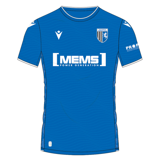
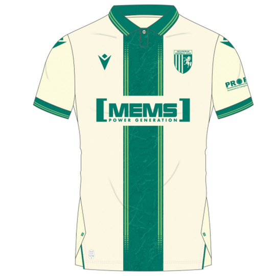
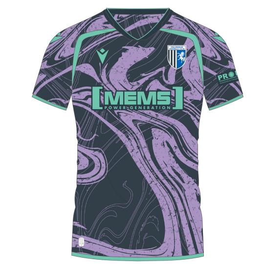
Obviously, I could not forget my beloved Gillingham’s kit. Here we have the absolute “Good, Bad, Ugly”…. all at the same club in the same season. The home blue is OK, if bland and it just looks like a half-hearted attempt to get some money out of the supporters. The away kit with the green looks absolutely fanatastic and possibly the best we have had for twenty years. Good? Superb. The third was (probably) a three year old’s first attempt on Canva. In the history of the past 60 years, I can only say that it is the WORST kit we have ever seen. Hopefully the next time I see it will be the end of year sales. Bad and Ugly!
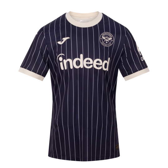
Brentford Away – Tailored for the Game
…and I think I should sign off with this from Joma at Brentford just to remind myself that I have finally given up trying to understand anything. “Inspired by the bespoke tailoring and timeless style of the Kingsman film franchise, this kit features and elegant navy-and-cream pinstripe design, complemented by a contrasting cream crew neck and monochrome club crest. Created in collaboration with Brentford Shareholder and Kingsman director Sir Matthew Vaughn, the shirt pays tribute to the craftsmanship and heritage of Savile Row, bringing together football, film and fashion in our most distinctive kit to date.” (That’s marketing-speak for a black shirt with cream pinstripes … which I would actually otherwise have liked.)
Edit: l saw ESPN has done a comprehensive list of their favourite shirts. Proves that preferences are just that, subjective views.
https://www.espn.co.uk/football/story/_/id/49163915/premier-league-202627-kits-ranking-every-jersey-released-arsenal-chelsea-liverpool-man-city-man-united-tottenham
Share