2025 Shirts Continued
With the season just a few days away (although Chelsea are still playing LAST season in the Club World Cup!), the new shirts are coming through fast and furious. As we have come to expect over the past few years, there is a collection of traditional, modern, just plain odd ….and horrific. As it is subjective, I will let everyone make their decisions!
Here is a mini gallery:
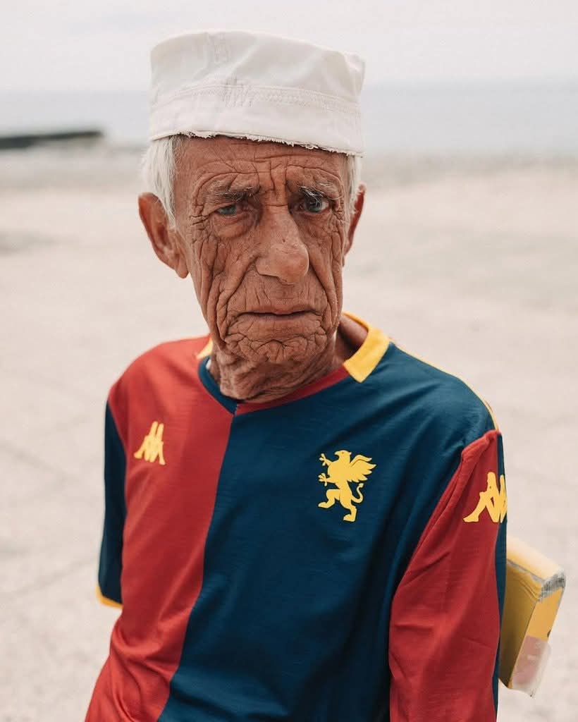
Genoa
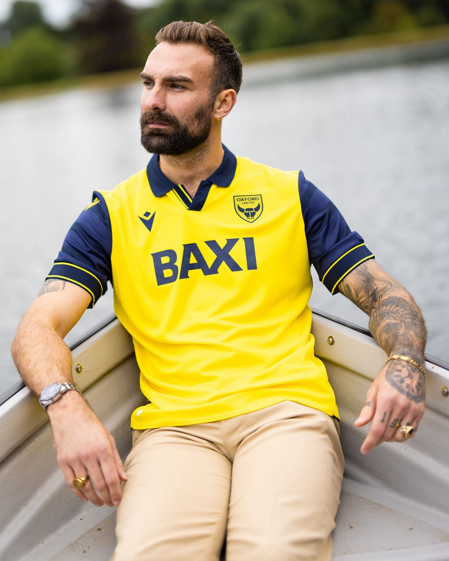
Oxford United – history preserved and a nice, clean design
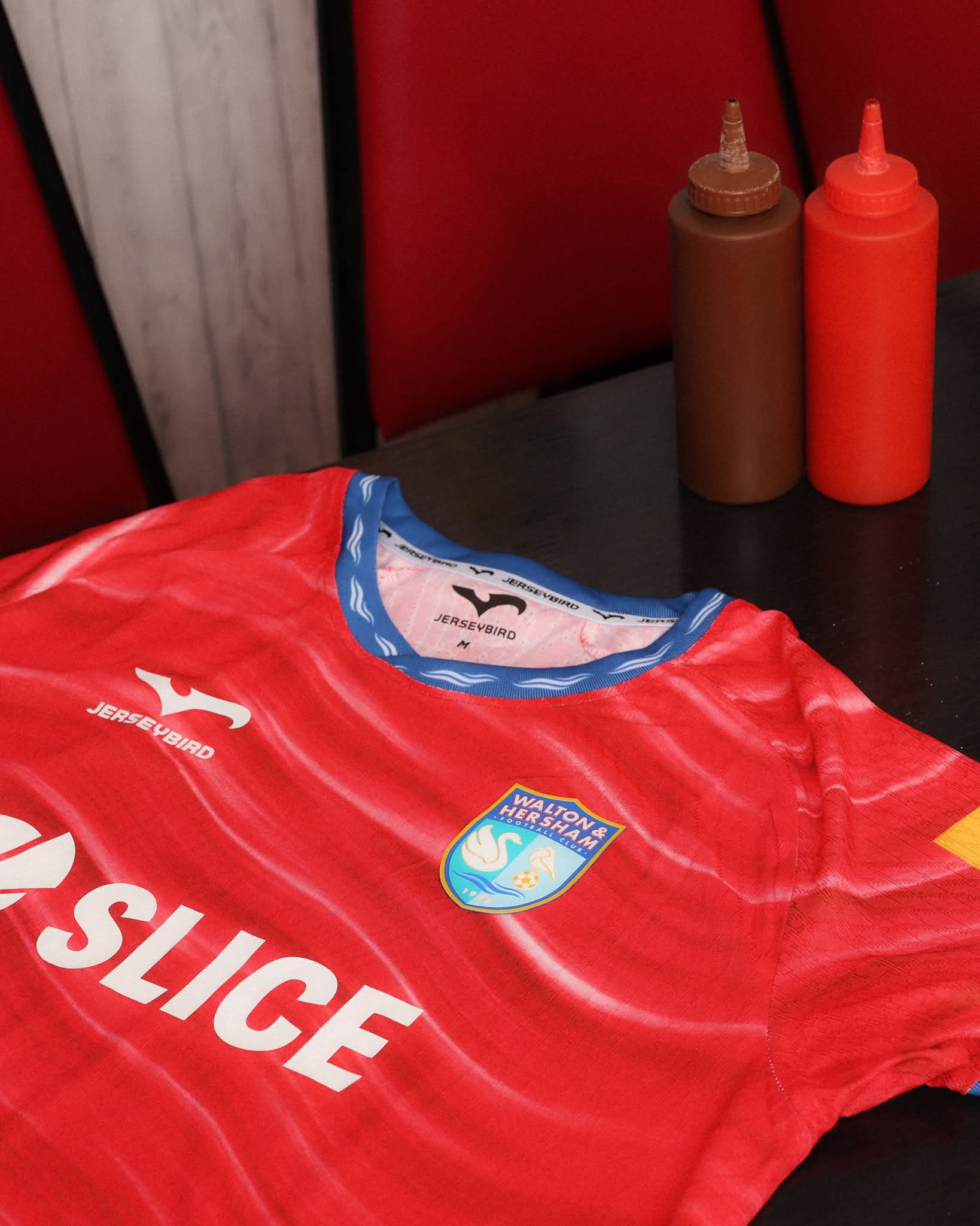
Walton&Hersham, in a cafe
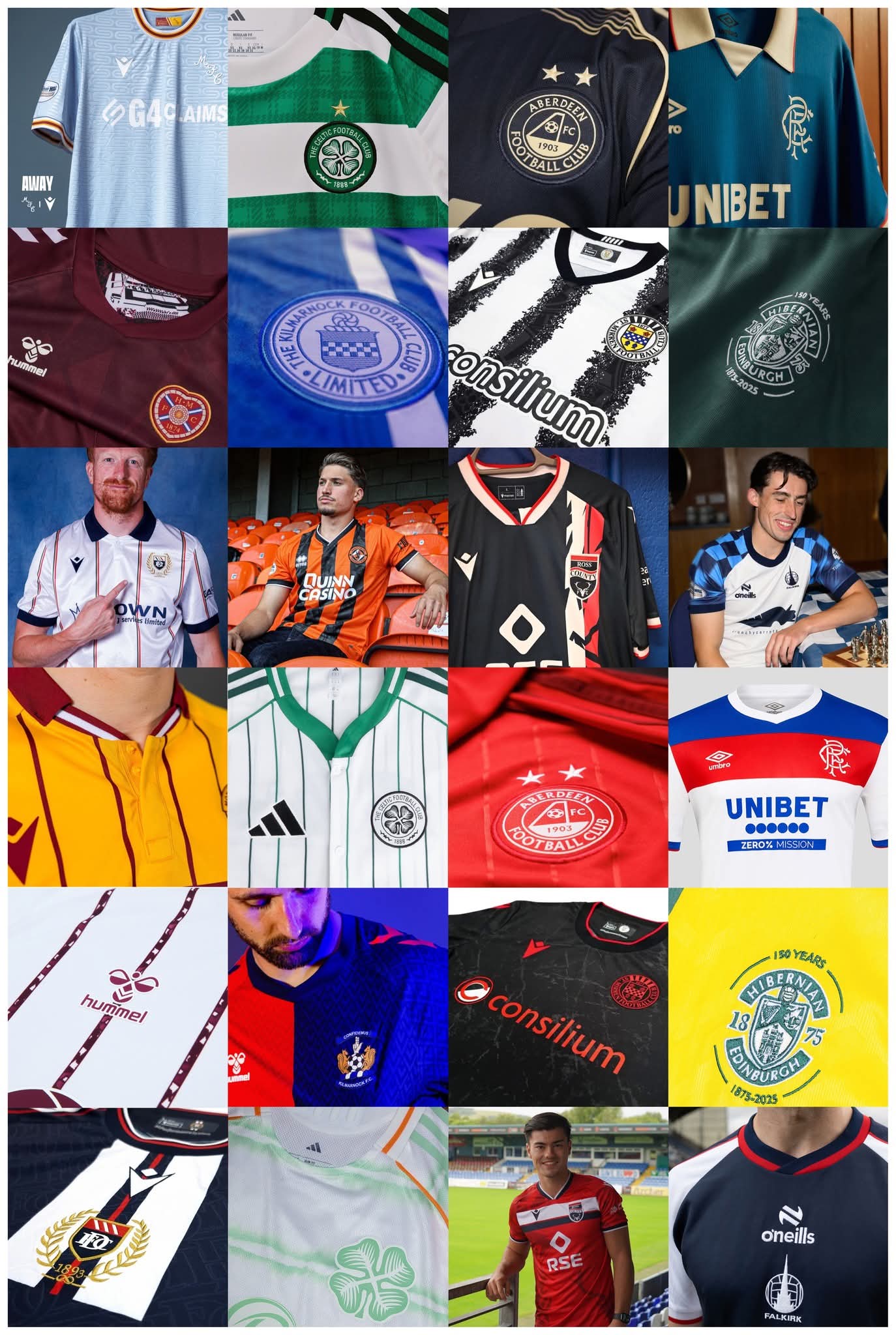
Scotland – A Nice Collage
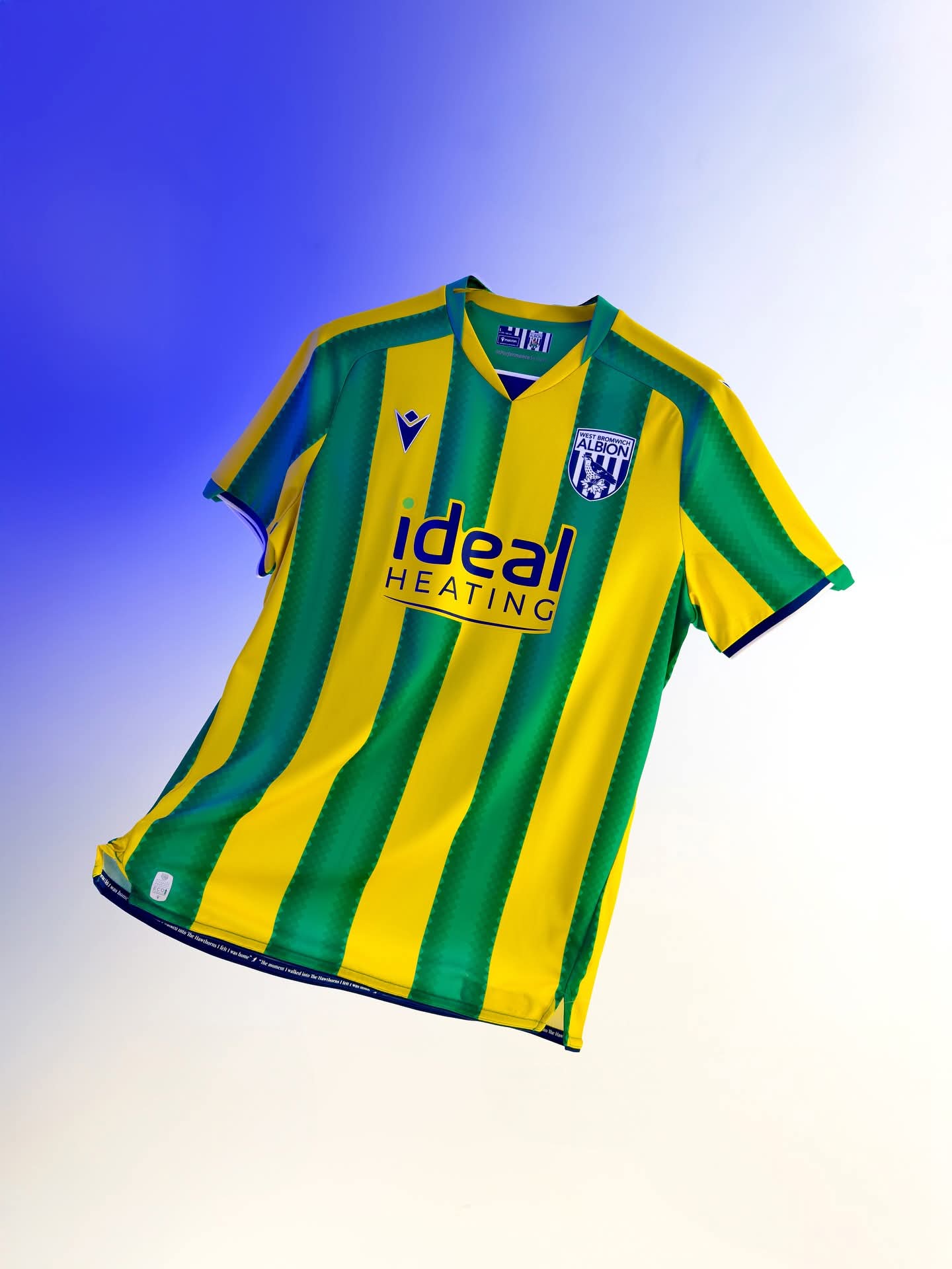
West Bromwich Albion Away, The best I have seen this Summer
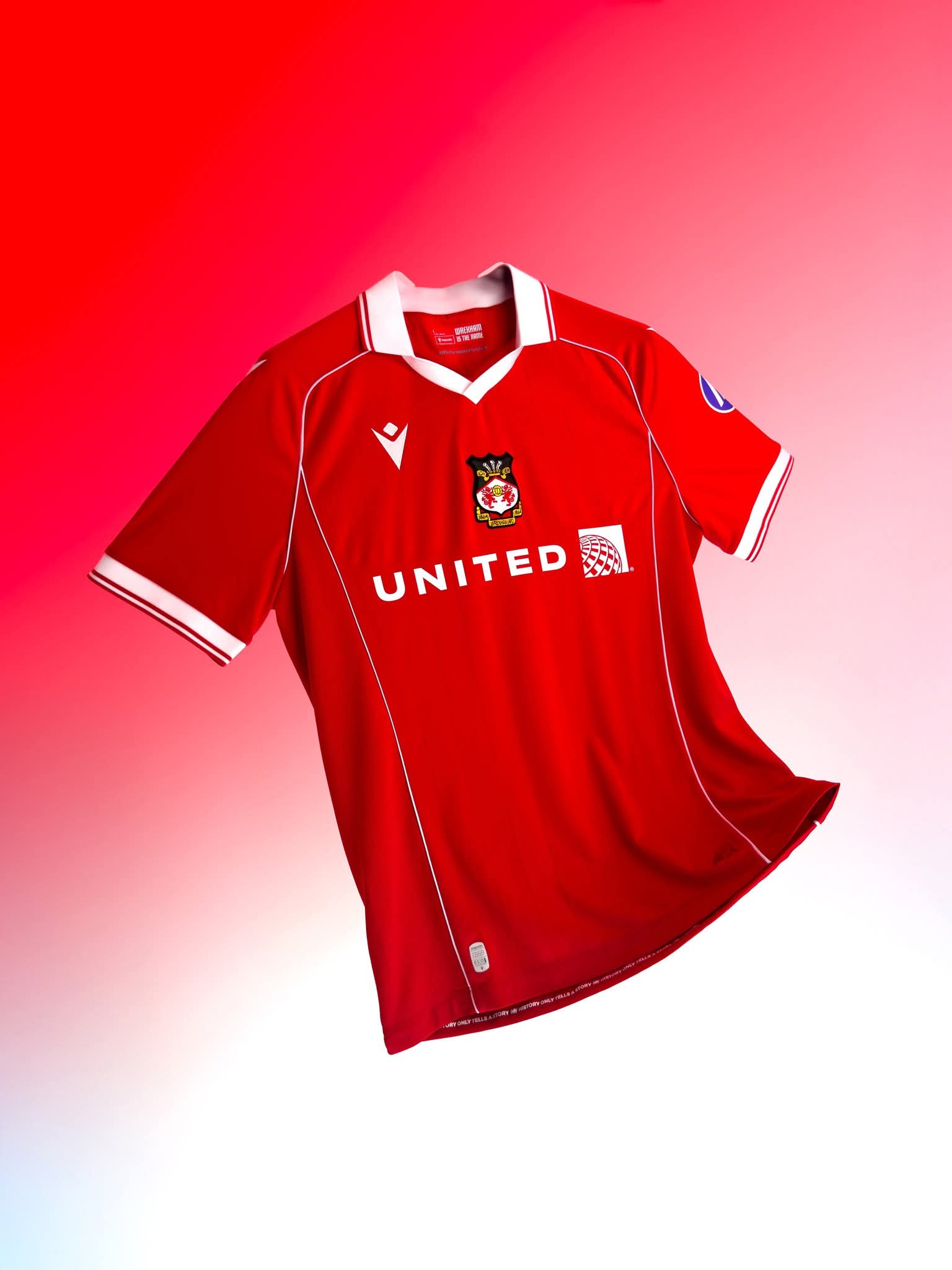
Wrexham – Nice and Traditional
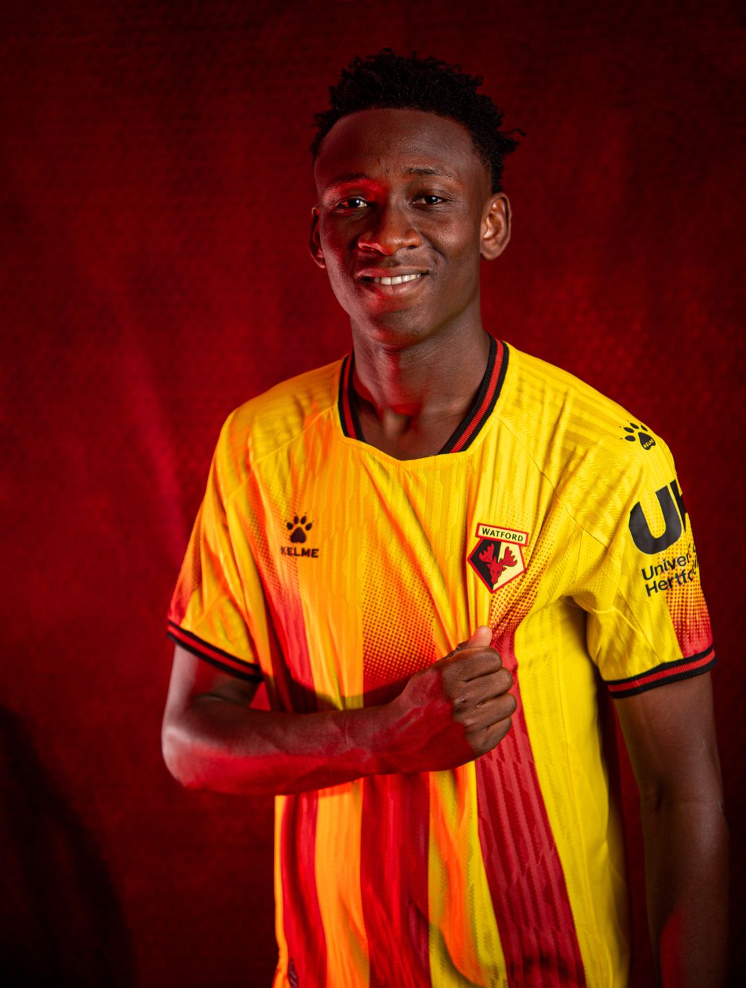
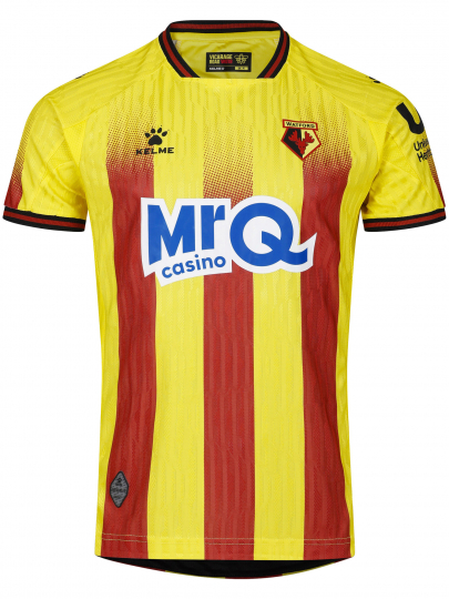
Maybe the story of the Summer is at Watford where even the club itself is (meekly) making a stand against the sponsor’s blue logo. They say, “On-pitch, players’ shirts will feature front of shirt sponsorship from MrQ, though, mindful that the new, blue MrQ Casino logo may not reflect the values or preferences of all supporters, the shirt will once again be available to buy unbranded.”
Last season the MrQ Casino was black and the shirt was well thought of both at the club and amongst fans. This season the blue all across the front is almost uniformly derided. I admire the club for speaking out and potentially prejudicing the sponsorship arrangement. Interesting days!
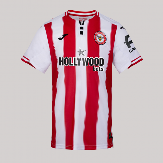
…and in another story of discontent, the new Brentford shirt has definitely not been universally applauded.